My Doctor
Visit onlineRole
Product Design, UX / UI
Design & Prototyping Tools
Figma, Illustrator | UI Components: Material UI
Time Frame
06 Months
Results & Impact
Quantitative Impact: 30% increased successful consultation bookings, 20% reduction in booking time. | Qualitative Feedback: Intuitive, Helpful, Ease of Use
Technology
Front End: React Native, React JS, Vue.js | Back End: Node.js + Express.js, Django (Python) | Database: MongoDB, PostgreSQL, Firebase | Authentication & Security: JWT, HIPAA-Compliant Security Protocols
-
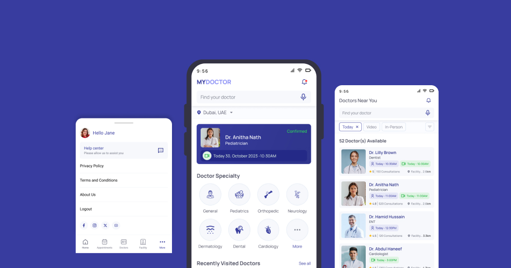
The healthcare industry is rapidly evolving, with advancements in technology reshaping the way medical services are delivered. Our company recognized the need for a convenient and efficient platform that allows doctors to provide consultations remotely. To address this need, we embarked on designing a healthcare mobile app for doctor consultation, aiming to streamline the process and improve access to healthcare services for both doctors and patients.
Project Overview
Objective: Design a seamless and accessible Doctor’s Consultation App that enables patients to connect with healthcare professionals easily, offering features like online consultations, appointment scheduling, and medical record management.
UX Research
Methods Used: • Surveys & Interviews:Engaged with 40 patients and 10 doctors. • User Personas:Created personas for different user groups (patients, doctors, caregivers). • Competitive Analysis: Competitors are Practo, 1mg, Zocdoc, Lybrate.
Key Insights: • Patients needed a simple, guided consultation process. • Doctors required an efficient appointment management system. • Caregivers needed easy access to patient records.
Solution:
Defined key features like video consultations , digital prescriptions , and reminder notifications.
-
Competitive Analysis:
Practo, 1mg, Zocdoc, Lybrate.
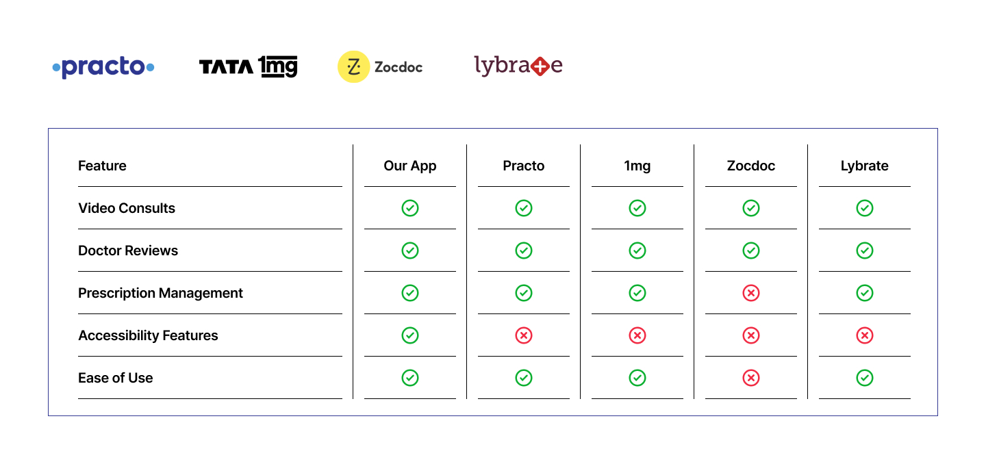
Key Differentiators: • Strong focus on accessibility. • Simplified consultation process. • Personalized health record management.
-
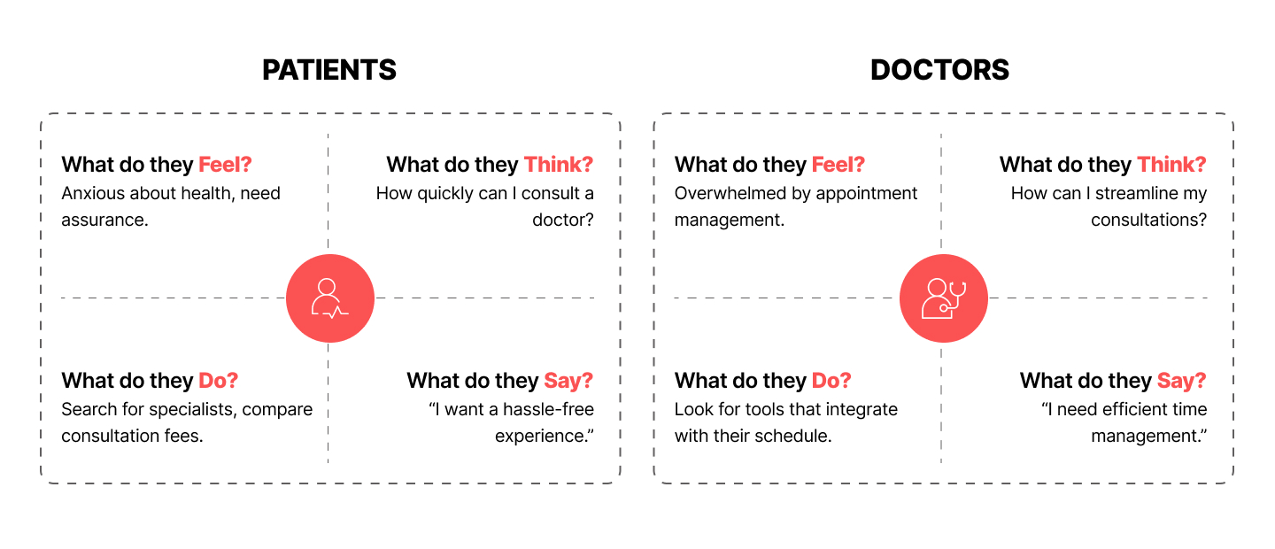
Empathy Mapping
Project Solutions, Pain Points, and Gains
Smart Appointment Management System
Features: • Real-Time Availability: Doctors can set their available time slots, and patients can book directly. • Automated Reminders: SMS/Email notifications to reduce no-shows. • Integration with Calendars: Sync with Google Calendar, Outlook, etc., for seamless time management.
Pain Points: • Patients’ Pain: Anxiety over delayed appointments and difficulty finding available doctors. • Doctors’ Pain: Struggles with managing appointment schedules manually.
Gains: • For Patients: A streamlined booking process with instant confirmation. • For Doctors: Reduced administrative workload and better control over their schedules.
-
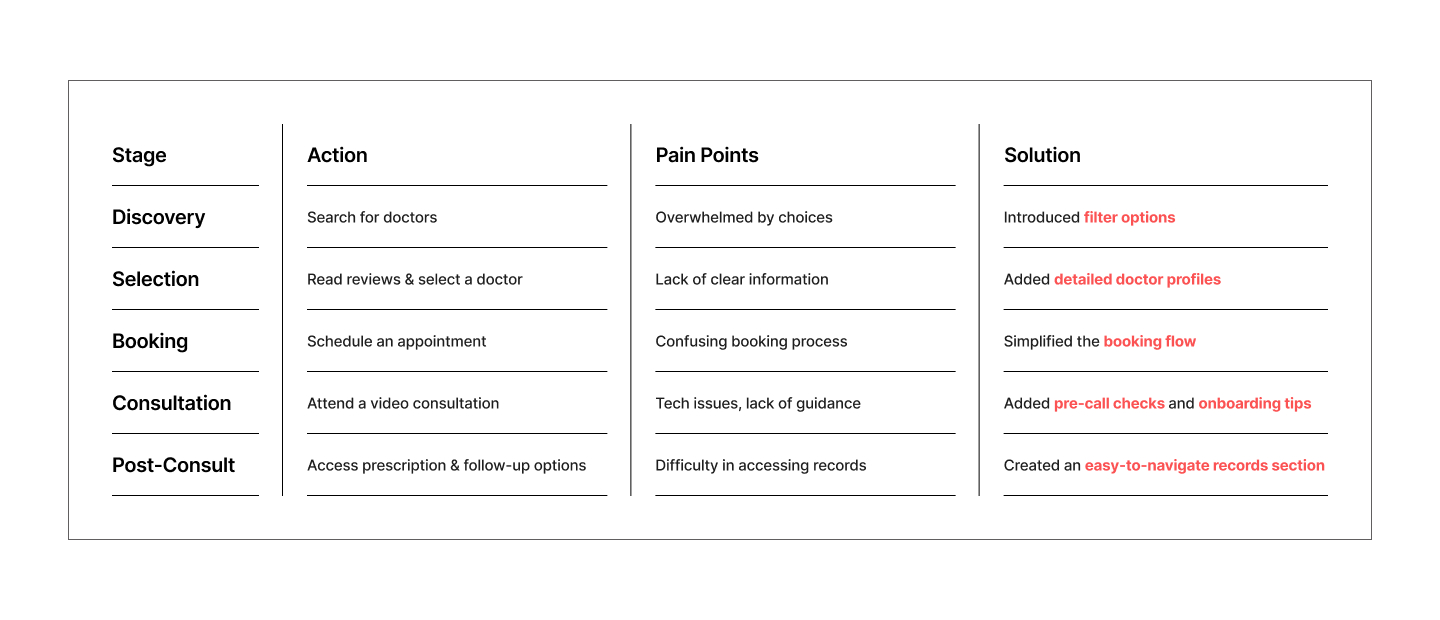
User Journey Mapping
User Journey: Booking a Consultation
-
User Personas
Based on personas for different user groups (patients, doctors)

Patient Persona: Anjali Nair
👤 Demographics:
Age: 32
Occupation: Marketing Executive
Location: Kochi, Kerala
Tech Proficiency: Intermediate🧠 Goals:
Quick and easy access to healthcare professionals.
Convenient scheduling of appointments.
Access to past medical records.😓 Pain Points:
Long waiting times at clinics.
Difficulty in finding the right specialist.
Limited access to medical history during consultations.💡 Needs:
User-friendly interface with quick booking options.
Reliable video consultation feature.
Clear communication of doctor availability.
Doctor Persona: Dr. Ramesh Menon
👤 Demographics:
Age: 35
Occupation: General Physician
Experience: 12 years
Location: Bangalore, India
Tech Proficiency: Advanced🧠 Goals:
Efficient management of appointments.
Reduce no-show rates.
Provide better care with access to patient history.😓 Pain Points:
Missed appointments due to unclear scheduling.
Difficulty managing follow-ups and reminders.
Limited tools to analyze patient records quickly.💡 Needs:
Easy-to-use dashboard with calendar integration.
Automated reminders for patients.
Secure access to patient medical records. -
Ideation and Prototype
During the Ideation and Prototyping phase, the primary goal was to address key user pain points and optimize the healthcare journey for both patients and doctors. Through brainstorming, wireframing, and iterative design, the following critical issues were resolved:
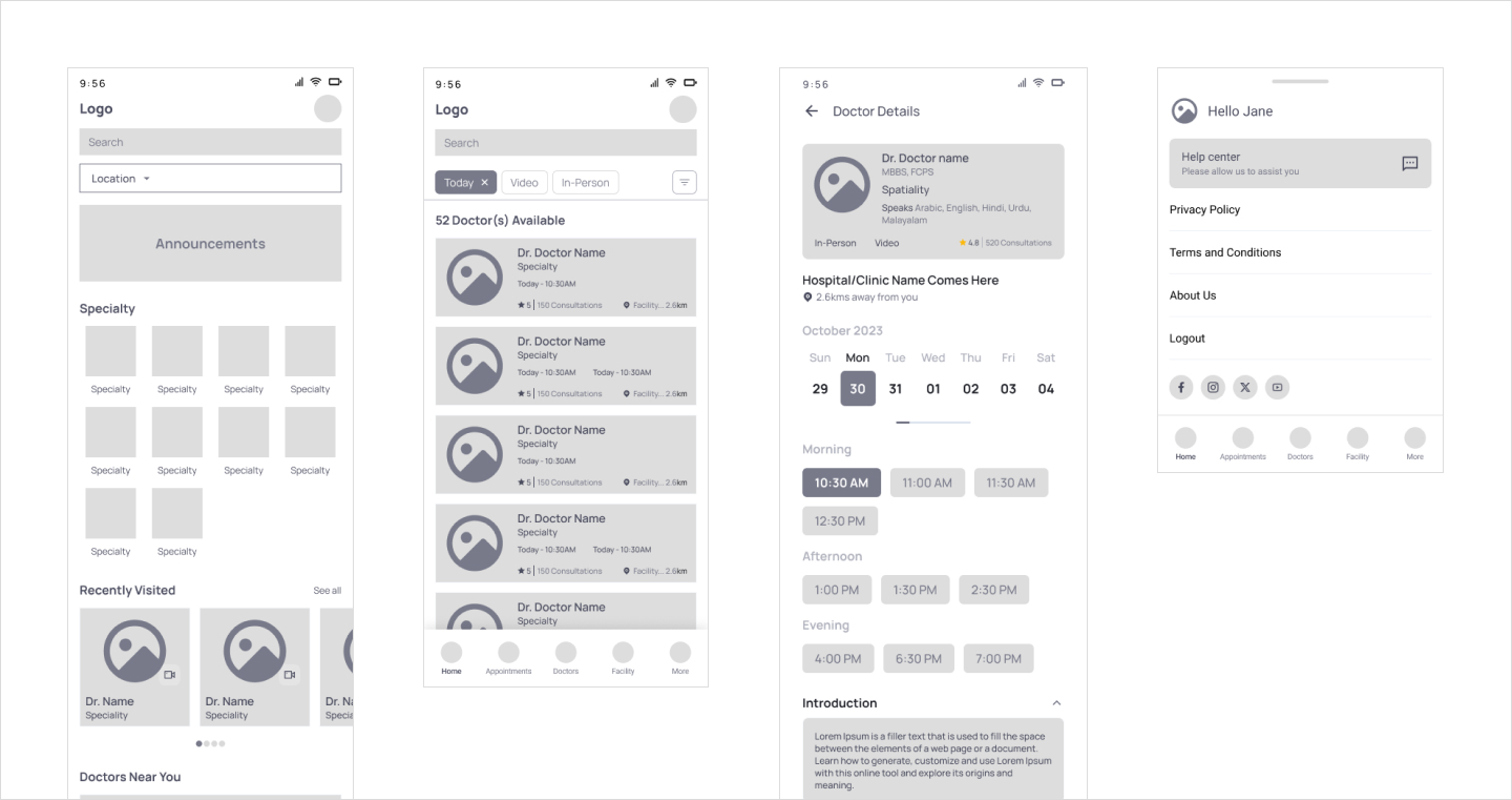
1. Complex & Time-Consuming Appointment Booking Process
Issue:
Users struggled with finding available doctors, leading to frustration.
Appointment booking required multiple steps, making it unintuitive.
No real-time availability updates, leading to canceled or missed appointments.Solution Implemented:
One-Tap Booking Flow – Simplified the process with fewer steps and a clean UI.
Smart Search & Filters – Patients could quickly find specialists based on symptoms, location, or insurance coverage.
Real-Time Slot Availability – Displayed instant updates on doctor availability to avoid last-minute cancellations.2. Fragmented Healthcare Services (Consultation, Pharmacy, and Reports Were Disconnected)
Issue:
Users had to switch between multiple apps for doctor consultations, pharmacy orders, and medical records.
Lack of a unified healthcare experience caused confusion and inefficiencies.Solution Implemented:
Integrated Healthcare Ecosystem – Combined consultation, pharmacy, and medical records in one platform.
Seamless Navigation – Users could book a doctor, get an e-prescription, and order medicines in a single workflow.
Auto-Sync Medical Records – Consultations and prescriptions were automatically stored for easy reference. -
Design Goals
Our design goals centered around the following principles:
Accessibility: Ensure the app is easy to navigate for both doctors and patients, regardless of their technical proficiency.
Efficiency: Streamline the consultation process to save time for both parties while maintaining the quality of care.
Trust: Establish a secure and reliable platform that instills confidence in users regarding data privacy and confidentiality.
-
Visual Design
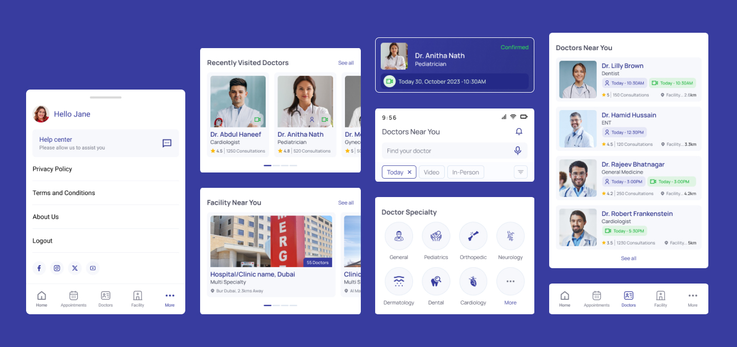
The visual design of the app incorporates a clean and intuitive interface with a calming color scheme to evoke a sense of trust and professionalism. Clear typography and visual hierarchy guide users through the app's features, making it easy to find information and initiate consultations.
-
Usability Testing
Usability testing played a crucial role in ensuring that the MyAster healthcare app delivered a seamless, user-friendly, and accessible experience for patients and healthcare professionals. Here’s a breakdown of the methodologies, testing approaches, and solutions implemented:
Moderated Usability Testing
Method: Conducted in-person or via remote sessions, where a facilitator guided users through key tasks.
Purpose: Gather qualitative insights on user behavior, frustrations, and expectations.
Outcome: Identified usability bottlenecks, such as difficulty in appointment booking and navigation challenges.Unmoderated Usability Testing
Method: Users performed tasks independently using a test environment, and their interactions were recorded for later analysis.
Purpose: Gather large-scale data on user behavior without bias from facilitators.
Outcome: Revealed common user pain points, like confusion in medication ordering and search inefficiencies.A/B Testing
Method: Compared two UI versions to determine which one performed better.
Purpose: Validate design choices, such as button placements, form layouts, and navigation structures.
Outcome: Improved primary CTA placements, reduced drop-off rates, and increased successful appointment bookings.First Click Testing
Method: Users were asked where they would click first to accomplish a task.
Purpose: Determine whether the navigation and UI structure were intuitive.
Outcome: Adjusted the placement of key features like doctor search filters and prescription refill buttons. 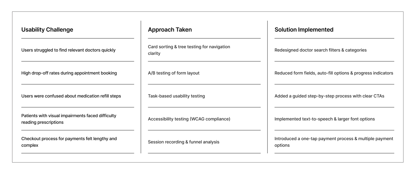
-
Final Design
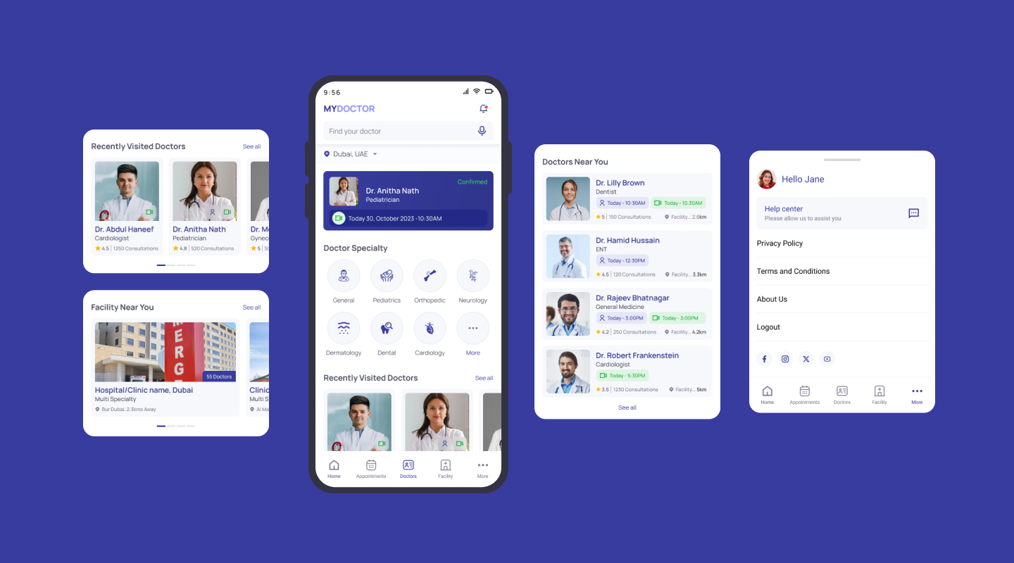
The final design of the healthcare mobile app for doctor consultation offers a seamless experience for both doctors and patients. Key features include:
Secure messaging for communication between doctors and patients
Appointment scheduling and management
Video consultation functionality with real-time audio and video capabilities
Electronic prescription and medical records management
Integration with payment gateways for seamless transactions
-
Conclusion
In conclusion, our healthcare mobile app for doctor consultation addresses the need for convenient and accessible healthcare services in today's digital age. By leveraging technology to connect doctors and patients remotely, we aim to improve healthcare accessibility, efficiency, and patient outcomes. Moving forward, we will continue to iterate and innovate based on user feedback, ensuring that our app remains a trusted solution for healthcare professionals and patients alike.
